THE RINGSHOUSE


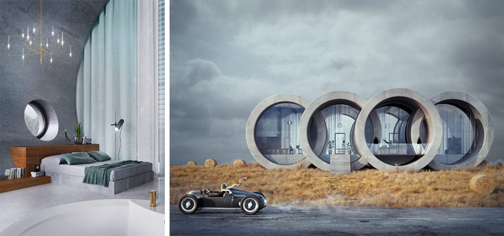
Polish architecture firm Wamhouse Studio has released design for a private house inspired by German car manufacturer Audi’s logo. The house, named The Ringshouse, is designed as the fifth house in a series of houses inspired by famous logos. Designed by Karina Wiciak, Principal of Wamhouse Studio, the designer emphasizes that the source of inspiration was also history – the history of a certain car brand and history of architecture.

Referencing to the shape of the logo directly, the building is associated with the brand, which was created in the 1930s and about which today almost no one remembers (a visible car model is also associated with it).
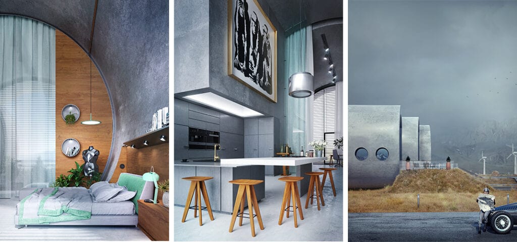
“The building also refers to architecture, modernism popular at that time. However, features typical of this style, such as raw concrete structures, rounded walls and windows, open internal space, large glazing – are reinterpreted here again,” said Karina Wiciak.
So it’s a contemporary building, but as the author notes, everything that is created today is the result of evolution and a continuation of what was once created.
Therefore, according to the author, it is worth reminding about it, and the house design can be a great excuse to tell an interesting story and not only the history of architecture.

The living area, very high and spacious, has been deliberately devoid of an additional floor, despite the fact that a significant height of the storey would allow it.
“The overall goal was to maintain the readability of 4 cylindrical bodies on the outside. Therefore, it is not a frugal home for a family, but rather a spacious holiday residence, situated among natural vegetation,” added the studio.
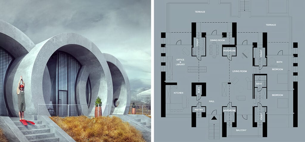
The aboveground part mainly includes large open rooms, partially fenced off with glass walls.
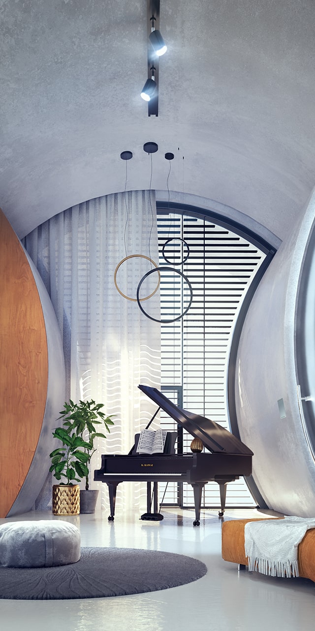
These include: a corridor with an open lounge, dining room and music corner, large kitchen, study room with library, 2 bedrooms with private bathrooms, 3 toilets, 2 separate wardrobes and 1 pantry.
As in previous houses in this series, Ringshouse has clearances on the surface of all large windows, making the form of the building becomes more readable.